Redesigning the GasBuddy mobile application
Regular
$1.436
1 hr ago - Adin
Premium
$1.796
2.5 hrs ago - Jeff
Midgrade
$1.669
2 hrs ago - Max
Diesel
$1.801
1 hr ago - Cherry
Fuel Prices
Amenities
Station Reviews
Report Prices

Select Route
Find Gas
Favourites
My Car
Profile

$1.494

$1.482
$1.494
$1.566
$1.436
$1.917
$1.512
$1.482
OVERVIEW
For this project, I chose to redesign the GasBuddy mobile application, a platform designed to help users locate affordable gas and save money through various useful tools.
ROLE
Solo Project
DURATION
12.2024 - 01.2025
SKILLS
User Research, Prototyping, Visual Design, Interaction Design
CONTEXT
People looking for the most affordable gas (whether near their location or along their route) often rely on GasBuddy. However, the app’s outdated UI, excessive ads, and cluttered layout make it difficult to quickly find relevant prices. This redesign focuses on modernizing the UI, improving information clarity, and reducing friction for a smoother experience.
PROBLEM STATEMENT
How might we improve GasBuddy’s navigation and UI design to help drivers quickly and efficiently find nearby gas prices without unnecessary steps or confusion?
RESEARCH
RESEARCH FINDINGS
Identifying the Problems
I first started with research, discovery, and competitive analysis to identify improvement opportunities. I then conducted user interviews with six participants, followed by a brief usability test to evaluate the current state of the app. Lastly, participants completed a survey to provide additional feedback on their GasBuddy experience.

Competitive Analysis
FINDING #1
“I just want to see the average gas price at a glance. Why do I have to sift through so much extra info?”
Users want key information, such as the average gas price in their area, to be clearly displayed and easy to find.
FINDING #2
“Finding a nearby gas station should be quick, but it’s more frustrating than it needs to be”
Although not ideal, users often glance at their phones while driving to find gas stations that meet their needs.
FINDING #3
“It shouldn't take so many taps just to find gas stations on my route”
Users had difficulty finding gas station information en route due to unclear navigation and layout.
BRAINSTORMING & IDEATION
WIREFRAMES
Improving Designs Through Iteration
Building on key insights from my research, I began sketching ideas to explore and visualize potential solutions. This iterative process was essential in refining my designs, allowing for continuous improvements along the way.
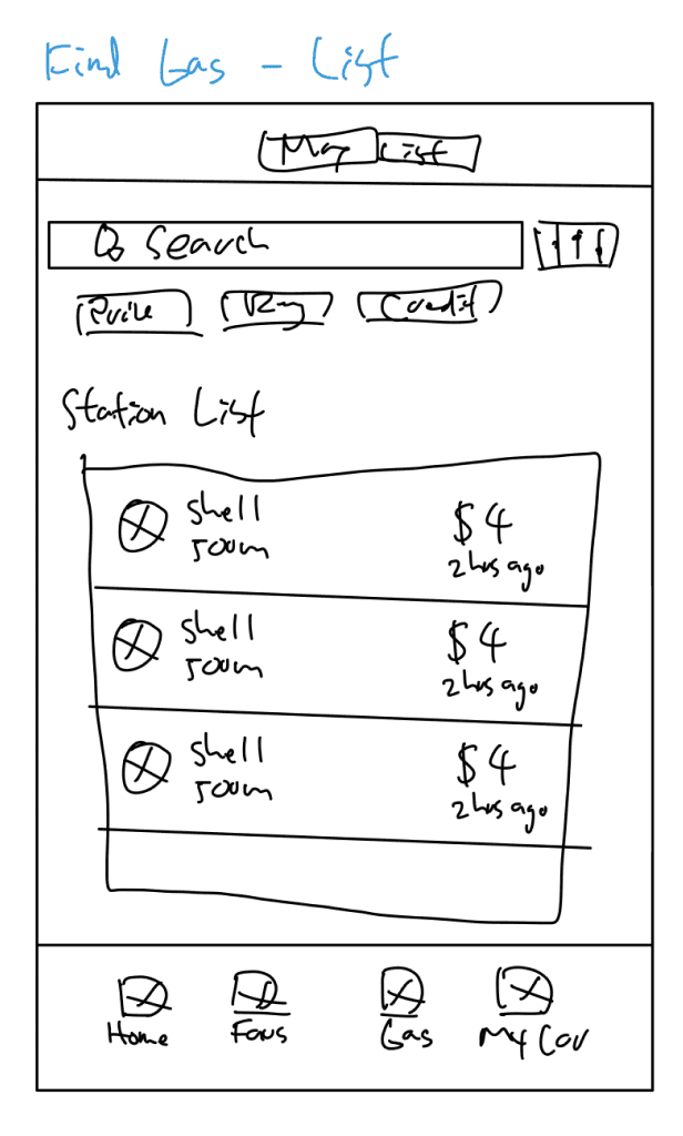
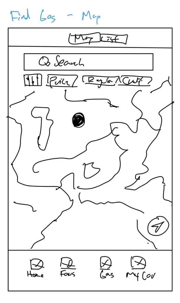
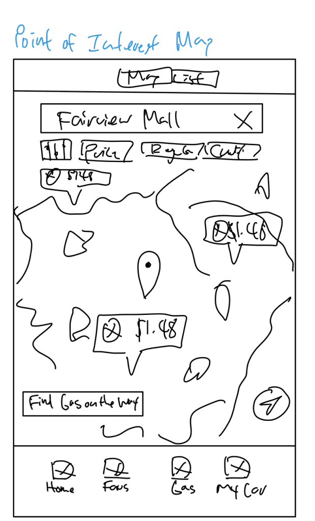
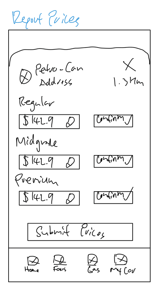
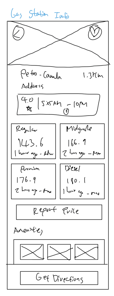
Sketches
After this, I transitioned to creating digital low-fidelity wireframes before moving on to high-fidelity designs, ensuring I could provide realistic and testable screens for users. During this phase, I identified areas that worked well and those that needed improvement—ranging from small details like missing icons to more significant issues like text readability. I carefully analyzed and addressed these challenges, refining my designs to create intuitive and user-friendly solutions.
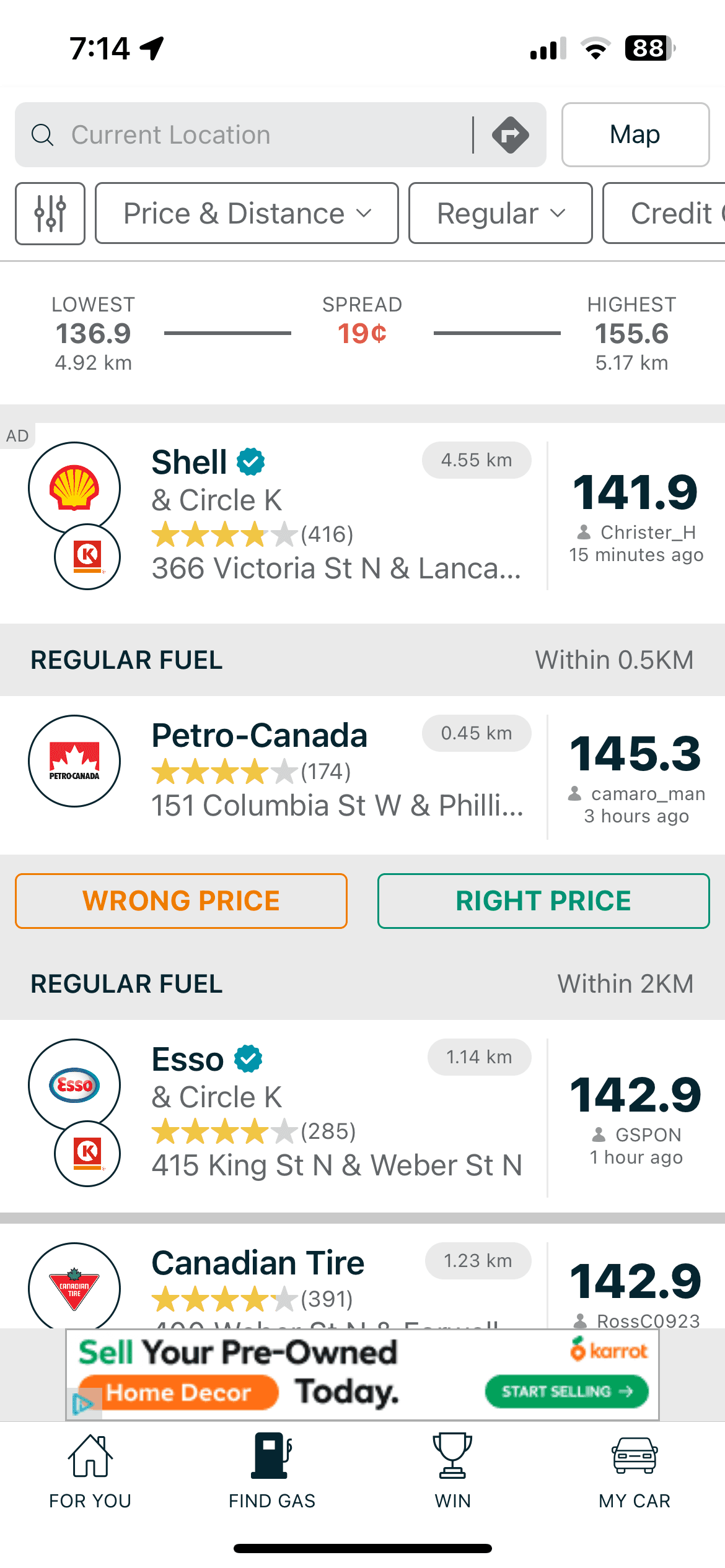
Shell
500m
$1.482
2 hrs ago
Petro-Can
640m
$1.494
1 hr ago
Petro-Can
1.3km
$1.436
38 mins ago
Petro-Can
3.2km
$1.917
12 mins ago
Shell
700m
$1.512
1.5 hr ago
Esso
2.9km
$1.566
3.2 hr ago
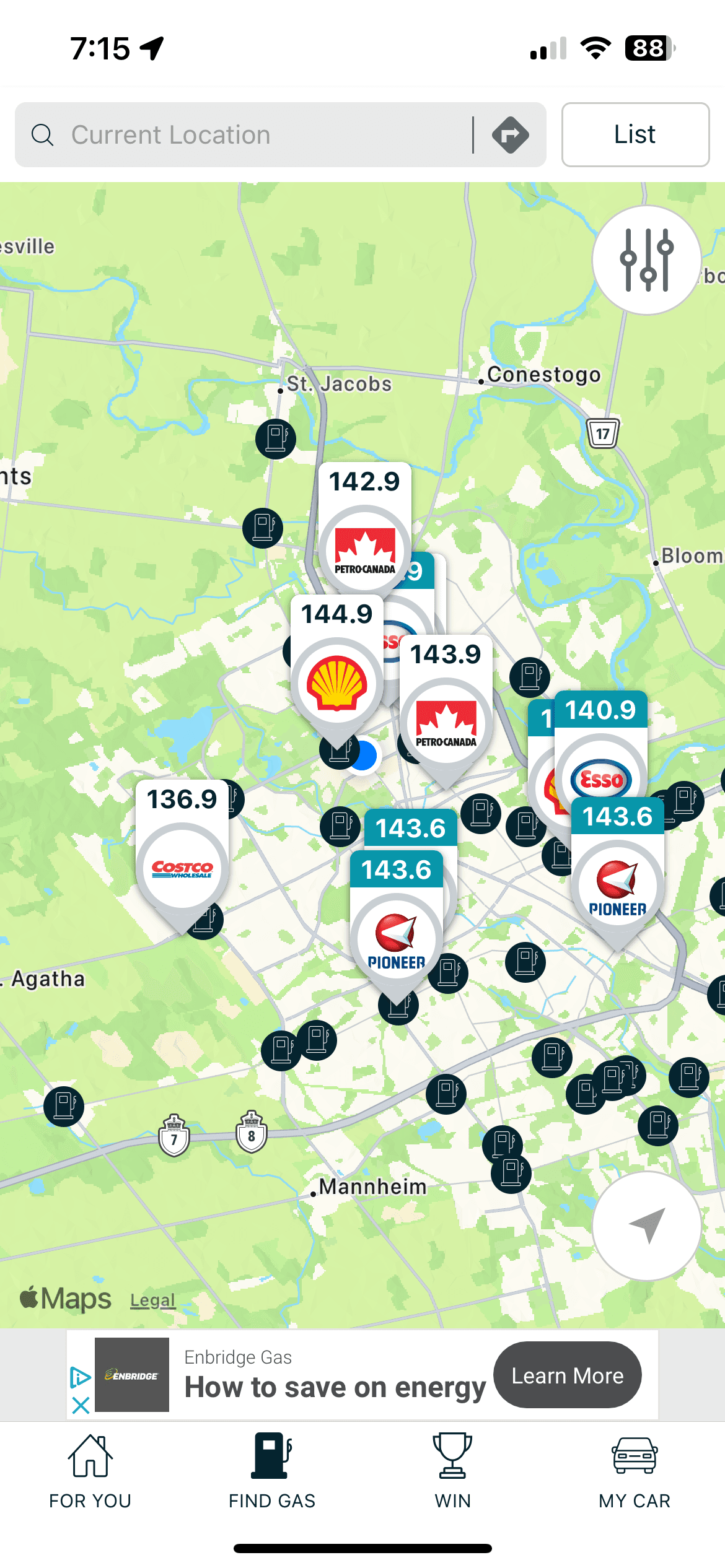
Find Gas In This Area
$1.512
$1.436
$1.917
$1.566
Find Gas on the Way
$1.482
$1.494
Regular
$1.436
1 hr ago - Adin
Premium
$1.796
2.5 hrs ago - Jeff
Midgrade
$1.669
2 hrs ago - Max
Diesel
$1.801
1 hr ago - Cherry
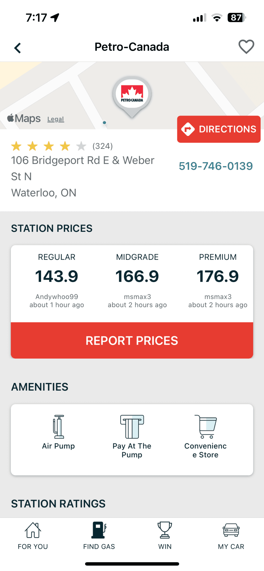
Report Prices
Amenities
Car Wash
Convenient Store
Pay At The Pump
Payphone
Get Directions
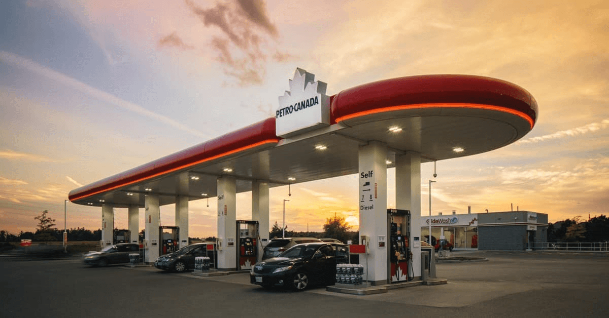
Petro-Can
106 Bridgeport Rd E & Weber St N
1.3km
Submit Prices
Hi-Fis
USER TESTING
DESIGN VALIDATION
Uncovering Key User Insights
With a polished high-fidelity prototype, I conducted user testing using similar methods as before. The goal was to identify what worked and what needed improvement, further refining the app for a more intuitive and user-friendly experience.
INSIGHT #1
The home screen lacks purpose and needs to prioritize quick, relevant information.
INSIGHT #2
The map and search functionality needs to be faster and more intuitive.
INSIGHT #3
The gas station detail pages have too much clutter and need a more focused layout.
PROTOTYPE ITERATION
ITERATION #1
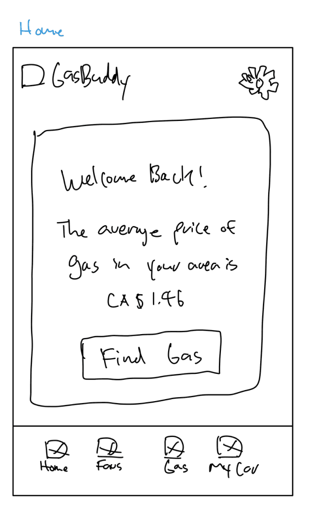
Transforming the Home Screen
Design Decision: Find Gas Page
I replaced the home screen with the "Find Gas" screen to streamline user flow and enhance efficiency. The original home screen lacked direct functionality, making it less useful to users. By immediately displaying the map screen, the app prioritizes its core purpose—helping users find nearby gas stations quickly—reducing friction and improving usability.


Original Screen
Find Gas
Favourites
My Car
Profile
Updated Screen
FINAL SOLUTION
MEASURING SUCCESS
USER METRICS
Reviewing KPI’s
Determining the success of the redesign required an evaluation of key performance indicators. To assess its effectiveness, I focused on the time on task, user error rate, and the System Usability Scale (SUS) score.
TIME ON TASK
~42% Improvement
Before: 1 min 30 secs
After: 52 secs
USER ERROR RATE
~54% Improvement
Before: 13/36 task errors
After: 6/36 task errors
SUS SCORE
~20% Improvement
Before: 70 points
After: 84 points
REFLECTION
Design for Your Users!!!
Throughout the design process, I found myself drawn to elements that matched my personal aesthetic and what I thought would improve the app’s look and feel. However, I soon realized that great design isn’t just about what looks good, it’s about what works best for the user. This experience reinforced the importance of prioritizing user needs over personal preferences, ensuring that every design choice enhances usability and functionality.
Design Isn’t a Checklist
The design process wasn’t linear. It required backtracking, iteration, and refinement. An example is that I initially thought my list view page was intuitive, but user testing revealed inefficiencies. Users found the full-page layout disruptive, making comparisons harder. This feedback pushed me to revisit the research stage and redesign it as a swipe-up menu, preserving map visibility. This experience reinforced that UX design demands flexibility, challenging assumptions, and continuous improvement to create a truly user-friendly experience.